My Journey into Freelance Design and Illustration

Buckle up, this is a long one, folks.

I am always inspired to hear other artists' stories of how they came to do what they do. Everyone's journey is different and has lessons others can learn from. Sometimes it's good to look back and think about the important stepping stones that led you to where you are today. By doing this, you can see how far you've come, where you are now, and where you want to go. That's kind of what I'll be doing in this post. I'm hoping it will be a good exercise for me to help me come up with the next steps I need to take to continue growing my little design business. But also, I want to share a bit more about who I am with you.

MHT_009_AboutMe_01.jpg

My Beginnings—Always an Artist

I don't remember a time when I didn't love to draw and make things. I was always the artsy crafty type. I had a giant drafting table in my bedroom for a number of years, and a good collection of art supplies. I used to copy characters from the VHS covers of Disney movies. I remember one drawing in particular that I did of Belle from Beauty and the Beast. I was surprised with how well it turned out (at least to my young mind) and it encouraged me to develop my drawing skills further. I sought out shows on TV about the making of movies and animation. This was before the age of YouTube and DVDs—you really had to dig deep to find that type of stuff! Books were also a great resource. Art was always a favorite class in school as well.

With all of this, it might surprise you to hear that my main focus in high school was science and math. I did well in these areas (a little rusty now, though, haha) and thought that would be the sensible direction to take in my education and career. But still, art was always in the background. As a senior in high school, when I was thinking about majors, I was trying to find a way to use my science and math skills, as well as my art skills. In my mind, I thought one field might be a perfect solution: architecture.

College—Deciding My Future

When I look back on it now, it seems odd that I decided to enter college as an architecture major. It wasn't something I'd been particularly interested in before, but the idea of being able to make a living designing things was appealing. My first semester went ok. I had a couple architecture classes to start out with—one about drafting plans, which was kind of fun, and the other about building codes (boooring). All in all it was just...ok. Second semester came, and I took a Drawing 101 class. Even though it was an art class, it was required for architecture students. I was smitten. I'd found my place. That semester, I dropped architecture and became an art major, and never looked back.

It helped that my sister, Dani, was also an art major and I could go through my schooling with her by my side. (Sidenote: I attended the same college at the same time as my two triplet sisters.) To their credit, my parents never criticized my decisions. From the very beginning, they were always encouraging of whatever I or my sisters wanted to do. I'm sure they had their worries, but they were supportive nonetheless. Only now as I look back do I fully appreciate how that helped me get to where I am today, even if it meant I had to do a lot more meandering to get there, as you will see.

While my sister Dani focused on illustration (She works as a children's illustrator today), I stuck with the general art degree. I knew I wanted to work as an artist, but I didn't know how. Did I want to sell art in galleries? Did I want to do graphic design? Children's books? I just didn't know. And that's where I ended up by the time I graduated.

Getting Sidetracked—My Years in Book Publishing

For some months after college, I went through an uncertain phase that I think a lot of graduates experience— trying to find work but not wanting to settle for a boring office or retail job (because then what did I do all that work in school for?) but also needing to move out of your parents' and earn a living. It was hard for me to get out of my comfort zone, so I stayed close to home, which greatly limited my job prospects, especially for an art school graduate. I made a few weak attempts at sending out my portfolio and creating a few greeting cards (probably none of which I actually sold). Enter book publishing.

If you browse the classifieds for jobs, you'll find a lot of positions in service, medical, and labor—not exactly what I was looking for. But one day, I found a post seeking a typesetter for a nearby company that worked for major book publishers. No, I didn't have any experience, and it wasn't exactly "art" per se. But it was somewhat design-related, and certainly something I was willing to learn. I applied, interviewed, and was (thankfully) hired.

Fast forward 10 years. I eventually became a top typesetter in the small company, and then, eventually, the only in-house typesetter as the company went through several mergers and a bit of downsizing, and then switched to outsourcing the majority of production work. I learned a lot at this job. I became knowledgeable in book publishing procedures; familiarized myself with industry software (especially Adobe Indesign); and learned how to communicate with clients and work with fellow employees. Design-wise, I developed my skills in typography and book design. These years were invaluable to me.

Finding My Niche

As I settled into day-to-day life at my office job, the goal in the back of my mind was always to eventually work for myself from home doing something creative, even if I wasn't quite sure exactly WHAT I wanted to do just yet. I found ways to stay involved in creative things. I tried my hand at blogging with an arts and craft site called Niki Jin Crafts. Today, I still continue with it (now at Make Happy Things), but have yet to dedicate enough time and energy to make a living at it. Once in a while, I found time to draw and make art. Working on my portfolio was always on my to-do list, but I rarely accomplished anything.

An important step in my journey was when I discovered the world of surface pattern. I found a book about pattern design—a rather dry and academic book to read, yet it sparked something in me. I found it fascinating. I went online and found other artists and whole communities of surface pattern enthusiasts. This was a turning point in realizing the type of artist I was. I realized how much I loved decoration, flourishes, and repeats. And flowers—all the flowers! I've also since discovered a love for typography and hand lettering, which I attribute partially to my work with books. So now, after many years of wandering aimlessly, so to speak, I had a better idea of what I wanted to do.

 Life Changes—Out of My Comfort Zone

So you'd think that once I knew what I wanted to do that I would take action, right? Nope. I mean, yes, I did start taking workshops and learning from online classes, and I added some patterns and lettering to my body of work, but I stayed comfortably settled at my day job. Like I mentioned before, I'm not one to wander out of my comfort zone often. That, and I'm super great at procrastination.

Then, BAM!, all the changes started happening at once. Within just a few years, I fell in love, got married, and had a child. Then, to top it all off, I got pregnant again AND moved across the country so my husband could attend school. Having to leave my job, now I was basically forced to figure out a new direction in my career. There was a lot of pressure to succeed because I was the majority of my family's financial support since my husband was a student. Since there were also two babies to take care of, I decided to try freelancing so I could stay home with them.

So after years of wandering, floundering, and procrastinating, I FINALLY took the first definitive steps towards my end goal of working as a creative freelancer!

Leading up to my move and my departure from my office job, I started looking at the freelancing site Upwork for small side jobs to get the ball rolling. I applied for both jobs I knew I had the skills and experience for (i.e., book design), as well as the types of jobs I wanted to do, like illustration. The first months working full-time from home were a little slow. But I did get a job. Then another. Eventually, I had a few good clients to keep me busy with regular work. Yay, me!

Where I Am Today

I have only been freelancing full-time for about a year and half now. I would say the majority of the work I do is still book design and typesetting (which, don't get me wrong, I still rather enjoy), but illustration and design work is becoming more and more frequent, which is exciting for me!  With the occasional creative design job and my own personal projects I feel like I am in a great artistic phase in my life right now, which I hope only continues for a long time to come. To be honest, I am very blessed to be where I am right now. If you'd asked me a few years ago where I wanted to end up, I would've said that I wanted to work for myself from home doing something I love. And look at me now. I work from home designing books, drawing pictures, and taking care of two beautiful little girls. I've made it.

Where I Want to Go Next

As happy as I am now, there's always room to grow, especially since I'm only really just getting started. I would love for the illustration and design work to continue to develop. Perhaps it would be nice to eventually create and successfully sell my own products, rather than working solely for clients. There's always the matter of money as well. It always comes down to the bills, doesn't it? (Sigh) While I make enough to get by, let's just say I'm no millionaire. But I'm not talking about wanting a life of luxury. Rather, I think having some financial stability gives peace of mind, which allows for more freedom to pursue creative goals. I think that's a holy grail goal that many artists strive for. Also, I have a husband aiming towards medical school, so... hello, student debt.

One Last Piece of Advice

If I were to give advice to an artist or designer looking to freelance, I would say, in the words of Nike, JUST DO IT. Do what you have to do. I mean, yeah, be wise about it—save a little money, develop a good portfolio, do your research, and make sure you know your stuff. The thing is, I had everything I needed for years, I just didn't act. I think both fear and comfort contributed to my delay—fear, because I was afraid of failing, and comfort because my long-time job with all its benefits and steady pay was hard to leave. But once I got started, it honestly took me less time than I thought it would to gain traction—and that's even with having my second baby in the midst of it all. There's no secret to success. If you do the work, the results will come. It's just taking it one step at a time. That's not to say there isn't the possibility for failure, of course, but you'll never know if you don't try!

Sincerely, Nicole

Links

All Business, But Having Fun

About Me (the short version)

The Pantone Color of the Year: Ultra Violet

This year's "Color of the Year" according to Pantone, a leading color resource for designers, is Ultra Violet (Pantone 18-3838). It is a blue-based purple hue that is inspired by the night sky.

UltraViolet.jpg

Some of the words Pantone uses in association with Ultra Violet include:

  • complex
  • contemplative
  • cosmos
  • limitless
  • unconventional
  • experimentation
  • meditation
  • reflection

I would definitely encourage you to check out Pantone's full description on their website. Ultra Violet is definitely a color that can inspire me, given my preference for deep, vivid colors. I love how Pantone seeks to make it a symbol of unlimited possibilities. Definitely motivating for artists!

As I mentioned in my previous post, if you go to their website, Pantone offers some suggested color palettes that include Ultra Violet. I used a couple of these in some of my floral pattern sketches as part of my monthly project.

2018-02_FloralPatterns_05.jpg
pantone-floral-fantasies.jpg
2018-02_FloralPatterns_06.jpg
pantone_desert-sunset.jpg

What do you think of Pantone's Color of the Year? Does it inspire you? Do you feel differently after reading Pantone's description? I'd love to know your thoughts!

Sincerely, Nicole

Links:

Pantone - Ultra Violet

This Month's Theme is...COLOR

Beyond Basic Color Theory—Four Things More Important Than the Color Wheel

How I Find My Colors


Where I Find My Colors

Now that I've discussed how to create an effective color palette, let me also mention that there's another way easier method—just use a color palette that already exists! When I'm working on a new design, I don't always develop my color scheme from scratch. I am constantly finding color inspiration and building a library of swatches and palettes that I can pull from when I need it. If I already have one on hand that would work great for my project, I take it and tweak it to fit my needs.

Color Palette Resources

There are numerous resources out there for finding color palettes. These are just a few that I use myself on a regular basis:

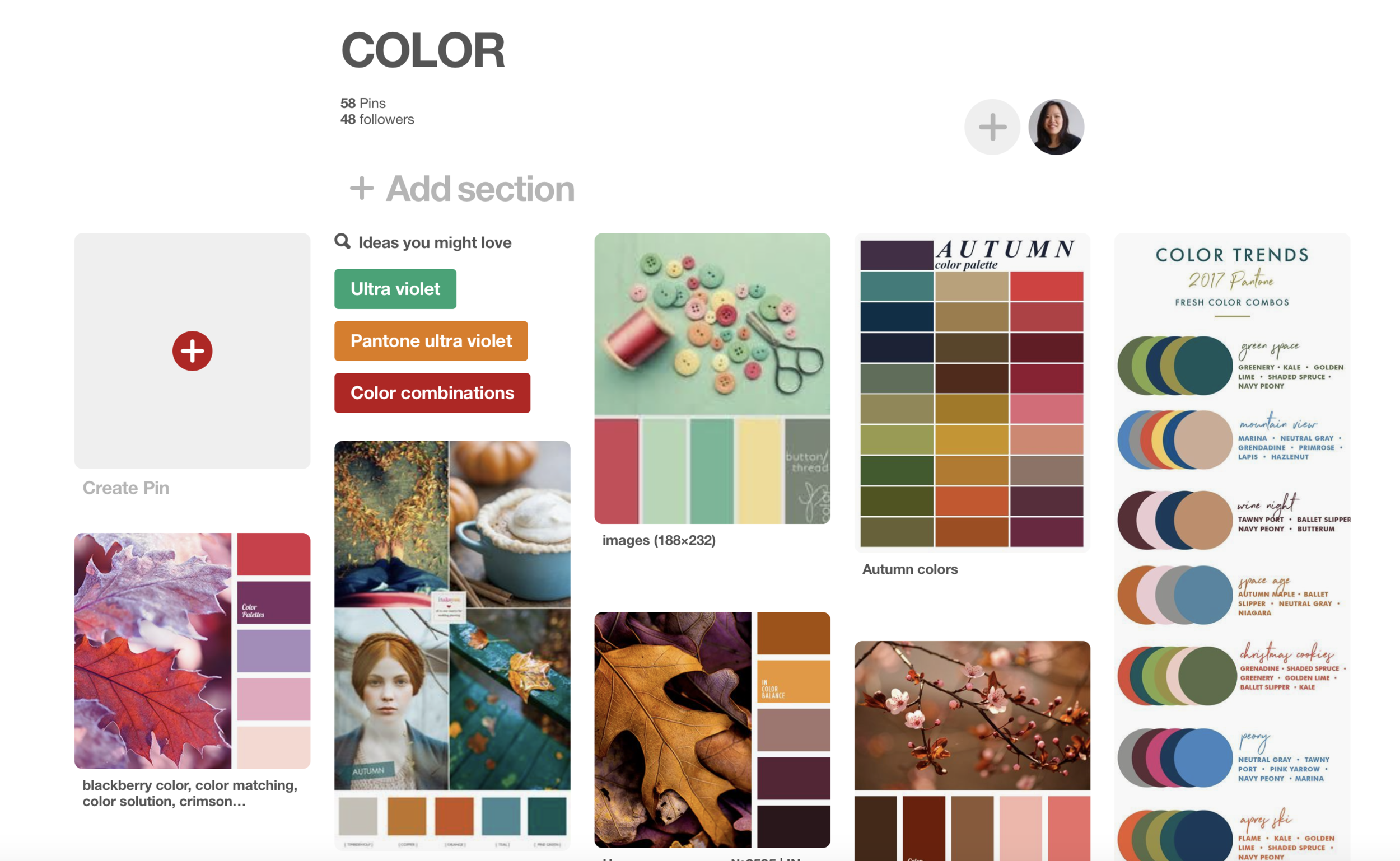
Pinterest

Is there no greater design resource? I mean, really, this one of my top places to find ideas for ANYTHING—art, cooking, crafts, home, and more. Nothing could be easier than typing "color palettes" into the search bar and seeing what pops up. You can get lost for hours pinning away.

Websites and apps

There are a number of websites and mobile apps tailored just for creating and discovering colors. You can view the palettes created by members of the community, or create your own. I've linked to a list of good sites and apps below.

Other art, patterns, photos

Use the above mentioned mobile apps and your camera phone to pull colors from physical items, such as photos, artwork, fabric swatches, or nature.

Pantone

Pantone is a standard color resource for designers and always a good place to start. They offer a number of products and resources for designers, including their own palettes that you can download for use in Adobe applications, such as Photoshop or Illustrator. (Psst... Stay tuned for more on my take on 2017's Pantone Color of the Year, Ultra Violet.)

Color Palette Inspiration

For some instant inspiration, here are some favorite color schemes I like that I've come across lately:

I feel that I tend to lean towards deep, saturated colors, especially jewel tones.

palette5.jpg
palette2.jpg
palette7.jpg
palette3.jpg

I'm also a sucker for anything with pink or red, my favorite colors. Pink and green tends to be my default color combination when I'm sketching florals.

palette12.jpg
palette9.jpg
palette10.jpg
palette11.jpg

Autumn hues make me happy because they remind me of my favorite time of year.

palette15.jpg
palette4.jpg
palette13.jpg
palette14.jpg

I love to see bright pops of color in more desaturated palettes.

palette18.jpg
palette16.jpg
palette17.jpg
palette19.jpg

Examples in My Work

Spoonflower occasionally uses a limited palette to inspire one of their weekly design challenges. Here are a couple that I've participated in.

snowatnight_palette.jpg
wildroses_palette.jpg

This last design was created for the current design challenge. It's open to public voting on February 15th and closes on the 20th. (EDIT: Voting now closed)

I hope you are excited to get out there and explore all the color around you. Till next time!

Sincerely, Nicole

Links

This Month's Theme is...COLOR

Beyond Basic Color Theory—Four Things More Important Than the Color Wheel

My Pinterest COLOR board

Color Meaning, Symbolism, And Psychology: What Do Different Colors Mean (a great article on the meanings of different colors)

Web and mobile app resources

12 Best Color Scheme Generator Web Apps for Designers (Designmodo)

Pantone

Browse color palettes online:

Color-Hex

COLOURlovers

Color Palettes

Beyond Basic Color Theory—Four Things More Important Than the Color Wheel

colorwheel.jpg

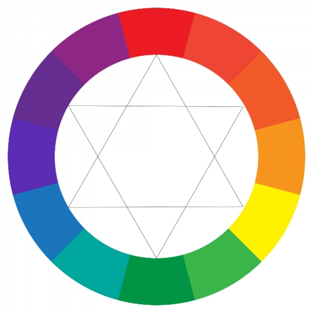
Primary, secondary, tertiary,  monochromatic, analogous, complementary, split-complementary, triad, warm, cool, neutral... Do you need to memorize all these terms? In my opinion—no. If you're anything like me, when you begin a project, you don't sit down with the color wheel and think, maybe I'll use a split-complementary color scheme in warm hues. Maybe you do—no judging here—but I think it's a more intuitive process for most people, meaning a lot of experimenting and playing around.

OK, well, I lied. If you're serious about art (and I'm assuming you are if you're reading this) than you should at least learn the basics. I mean, if you're physically mixing paint colors, obviously you need to know how colors blend together. (For instance, did you know that combining complementary colors creates a neutral? I talk more about this later...) If you're working professionally, or plan to in the future, you'll want to be able to communicate with your clients about color. I'm not going to go into all those terms in depth here, though—there are plenty of resources out there about color theory. I simply want to talk about the process of creating a color palette.

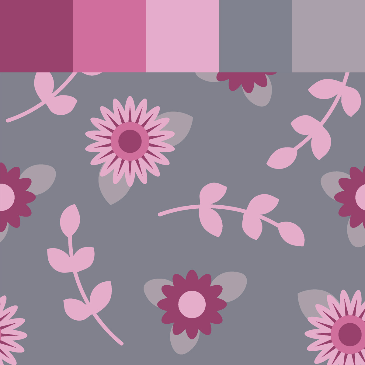
What's MORE important than knowing the color wheel inside and out is knowing what it is that makes a color palette effective. There are no hard and fast rules saying you can't combine one color with any of the others. It's how you do it. You'll also need to consider the purpose for your piece, as well as the mood you are trying to evoke so that you choose a color scheme that helps attain those end goals. By all means, you can (and should) still play around with your colors, but it's good to have a little knowledge to back up your decisions, and perhaps make the process more efficient for you. Here are four things that I feel are more important than knowing whether your palette is analogous or tertiary...

color_palette_example.jpg

1. Contrast

Whenever I create a design that I think looks (for lack of a better word) boring, 90% of the time I can trace it back to a lack of contrast—more specifically, contrast of values (or lights and darks). I think contrast is one of the key elements of a good color palette. Without it, a design tends to look flat and uninteresting. To achieve good value contrast, usually you want one nice dark color, one very light color, and a variety of shades in between. Sometimes it can be difficult to accurately assess your light/dark contrast when you become distracted by the different hues and shapes (for instance, bright colors might seem lighter than they actually are), so one trick is to look at your design, or palette, with squinted eyes. It also helps to stand at a distance. The idea is to blur out the image so all you see is the impression of how the lights and darks are working in your piece. If you're working digitally, you can also simply view your piece in grayscale mode. If your design looks like all one boring shade of gray, you might want to tweak your palette.

contrast_bad.jpg
contrast_better.jpg

2. Harmony

Now that I've addressed the need for variety and contrast in a design, I must also add that the colors must, of course, still work together as one, creating harmony. Here are a few ways to create color harmony:

Use similar hues

This could be a two colors like blue and green, or different shades of one color (this would be analogous or monochromatic if you want to get all technical). This isn't always the most fun way to go, so luckily there are other ways to create harmony...

Monochromatic color scheme

Monochromatic color scheme

Temperature

You may already know that blues and purples are considered "cool" while reds and oranges are "warm," but to go further, there are warm and cool variations of all hues. You can absolutely have a warm palette that includes blue, or a cool palette with red—but whether warm or cool, it should be either one or the other, not a mix.

Cool colors

Cool colors

Warm colors

Warm colors

Saturation

This refers to how bright or dull a color appears. Highly saturated colors are pure and vivid, while less saturated colors are more muted and neutral, which happens when you mix black or white to a base color (also referred to as "tints" and "shades"). Going back to that color wheel (yeah, I guess it does come in handy) mixing a hue with its complement (or a color that appears across from it) will also make a color more neutral. Having similar levels of saturation throughout your palette can help create harmony. That being said, you'll probably still want to reserve the brightest, most saturated colors to add "pops" of color and accents, since bombarding the eye with too many saturated colors throughout your piece can cause visual fatigue (this goes back to the idea of contrast). That's not to say you can't have all bright or all soft colors in your design. There's mood and purpose to consider as well...

3. Mood and Purpose

When you start a piece, do you ask yourself why you're creating it? For example, if you're designing a surface pattern, what is the end purpose—fabric for quilting, wallpaper, clothing? Who are you making this for? The answers to these questions should be directing your decisions throughout the entire process, including color choices. There are a few key points to consider regarding mood:

Psychology of Color

There are deep connections between color and emotions. They can spark feelings of excitement, peace, fun, anger, happiness... you get the picture. You can also use color to convey moods, such as rustic, natural, or urban. People have written loads about the psychology of color, and it is interesting to research. When you approach your design, step back and look at your colors and focus on the emotions and images they evoke. Are those the same ideas you want your overall design to present?

Holidays and seasons

People make automatic associations between specific colors and holidays and seasons. One obvious example is pairing Christmas with red and green. It's good to keep this in mind if you're designing a seasonal piece.

Your Audience

Evaluate who your design needs to appeal to and let that guide your color decisions as well. For example, soft pastels are often used in feminine or baby designs. Darks and neutrals are more masculine. Designs aimed at toddlers and kids are usually full of bright, saturated colors.

4. Finally, there are always exceptions.

When it comes to color, there are no solid rules. Use your intuition and do what looks and feels right to you. Perhaps take these guidelines, and turn them upside down to create something unexpected. Sometimes breaking the rules makes the most impact!

I hope you find these guidelines helpful. As always, enjoy the process. Art—and color—is fun!

Sincerely, Nicole

Links

 This Month's Theme is...COLOR