Six Mistakes I've Been Making in my Surface Pattern Design

I've been making patterns for several years. Even now, I feel I still have a lot to learn. Though I have had a formal art education, it was not specific to textile or surface design—I discovered my love for patterns later on. In addition, I don't have a ton of professional experience when it comes to pattern design—mostly I create for my personal POD shops, like Spoonflower, and to build my portfolio. Obviously, it is a goal of mine to take my designs as far as I can go. I've been evaluating my process lately, and I think there are some mistakes that I always make that I need to work on. I thought I'd share my thoughts, in the hopes that my fellow pattern lovers can learn from them, too!

NS_ArtBlog_181009_6MistakesSPD.jpg

1. Skipping Research

I'm just awful at this. Like many others, I'm sure, I get excited about an idea and dive right in. I barely even do any sketching! I think a lot of my patterns could be a lot better if I'd taken the time to soak in some related imagery, experimented with forms and compositions, and worked things out in sketches. Considering trends would help make my work more marketable as well. With all this in mind, I've been working this month with my Inktober project to learn about different flowers and plant structures. Since I do a lot of florals, I'm hoping this will improve my work overall.

2. Making my repeats too small

A lot of the time I make my repeats the size of Spoonflower swatches (8x8 inches), or sometimes 12x12 (a standard scrapbook paper size). Lately, I'm beginning to realize that perhaps I am making my repeat swatches too small. Having a larger size base pattern has the advantage of avoiding obvious sections of repeats within the bigger swatch. According to this excerpt from a textile handbook, repeats should be scaled to the width of the fabric (24 inches and above). This could be divided into a smaller division of the total size. Somewhere between 14 and 16 inches is common—still larger than my usual. Of course, this all depends on the end goal of your pattern and the process by which it will be manufactured. Which brings me to my next mistake...

 3. Having no end product in mind

There are many questions I should be asking myself when I approach a new design: Is this design for stationery, apparel fabric, upholstery fabric, wallpaper, gift wrap, etc.? Who is my ideal audience/customer and what do they like? Mostly I just tend to draw something pretty and make a pattern out of it, but if I plan to sell my designs, I need to think beyond that. Knowing what the end goal is will inform many choices—style, scale, colors, and limitations with manufacturing, and so on.

 4. Designing single patterns and not collections

My portfolio is full of single patterns that were done for challenges or quickly done for fun, and never thought of again. My approach needs to change to focus more on creating fully conceived collections. I've written about this previously. I think I have a hard time with this because of my short attention span. It is hard for me to stay devoted to one project for too long. I need to work on my artistic endurance, so to speak!

5. Not turning my work upside down

When considering all-over patterns that are meant to be viewed from any direction, it makes sense that we should make sure the patterns truly work from any view. It seems obvious, yet I've hardly ever turned my design around as I'm working. And it's so simple just to turn your paper, or rotate your digital canvas. Usually, I just place my elements in random directions and call it good, but I came to the realization one day when looking at a printout of one of my patterns that you can recognize new issues when you turn your design over. And this brings me to my final point...

6. Not printing out my patterns

I don't know how many times I've uploaded a design to Spoonflower and ordered a swatch only to find that I did not like the scale, colors, composition, or something else. I finally had an "Aha!" moment and started printing out swatches on my inkjet printer. I don't know why I never did it before—laziness? saving paper?—but it really helps to see your design printed out, especially if you work digitally. You can recognize issues that you might not see onscreen. Sometimes I just print a low quality "draft" version (because ink is ex-pen-sive), and though that won't help as much with color, you can still get a sense of the scale and overall composition of your design. (Make sure you print at 100% to get an accurate representation.)

So those are six things I'd like to work on in my surface pattern design process. I hope this is helpful to you as well! Please let me know what advice you have. I’d love to hear from you.

Sincerely, Nicole
Finding Time for Creative Pursuits

Ah, vacation.

This past month, I was able to drive across the country to New Hampshire to visit family for a few weeks. Even the long drive with two little ones was non-stressful and fun. Although I did end up taking work with me (oh, the life of a freelancer—gotta love it) I still got to spend a lot of time with my family, reunite with loved ones I don't see often, and take in the beautiful spring scenery of the New England area, which I consider home. It was a much-needed pick-me-up for my soul.

It's been a bit of a struggle lately as far as my creative output. Work is doing well enough, which is great, but with that comes less time to work on personal stuff. There are several professional goals I've been working toward this year as far as building my portfolio and building my career as an artist. While I've had some successes, I also feel like I've come to a halt. It isn't so much a lack of motivation (as in the past) but it is now more due to a lack of TIME.

Here are a few things that have helped me to make time to create:

1. Draw, write, make... (whatever you do) every day.

Even if it's just for a few minutes. Even if you think it's trash. Perhaps allot a specific time each day, such as before you start work or before you go to bed. It's all about developing habits and creating output. Nothing will happen unless you DO. Creating on a regular basis is the only way you will produce work, hone your skills, and develop your unique style.

2. Learn to let go and get help!

As a freelancer and stay-at-home mom, I often just have too many things on my plate. It doesn't help that I am also a bit of a control freak and overachiever. I want to do everything and I want to get it done ASAP. I really need to learn to step back and let things go sometimes. Not everything needs to be done immediately or done perfectly or done by me. Or even done at all (I'm talking things like cooking dinner—not client work, haha. Yes, my family probably eats out more than we should, but I get more done!) This past month was actually the first time since I started freelancing that I enlisted other people to help me with some of the tasks that were sucking up my time. It was hard to let someone else help me, but in the end, it was a lifesaver. Work smarter, not harder, right?

3. Create a calendar

Write down your goals so you know where you want to be a month, 6 months, a year, and/or 5 years from now. Divide your goals into smaller tasks and map out those tasks onto a calendar so you have a path to where you want to end up. It might not always go exactly to plan, but it is a good starting point and something you can reference now and again.

Now, I am definitely not the greatest at following my own advice. But you can't beat yourself up over it. Just keep going!

Are you a busy artist as well? How do YOU find time to do what you love? I would love to hear from you!

Till next time.
Sincerely, Nicole

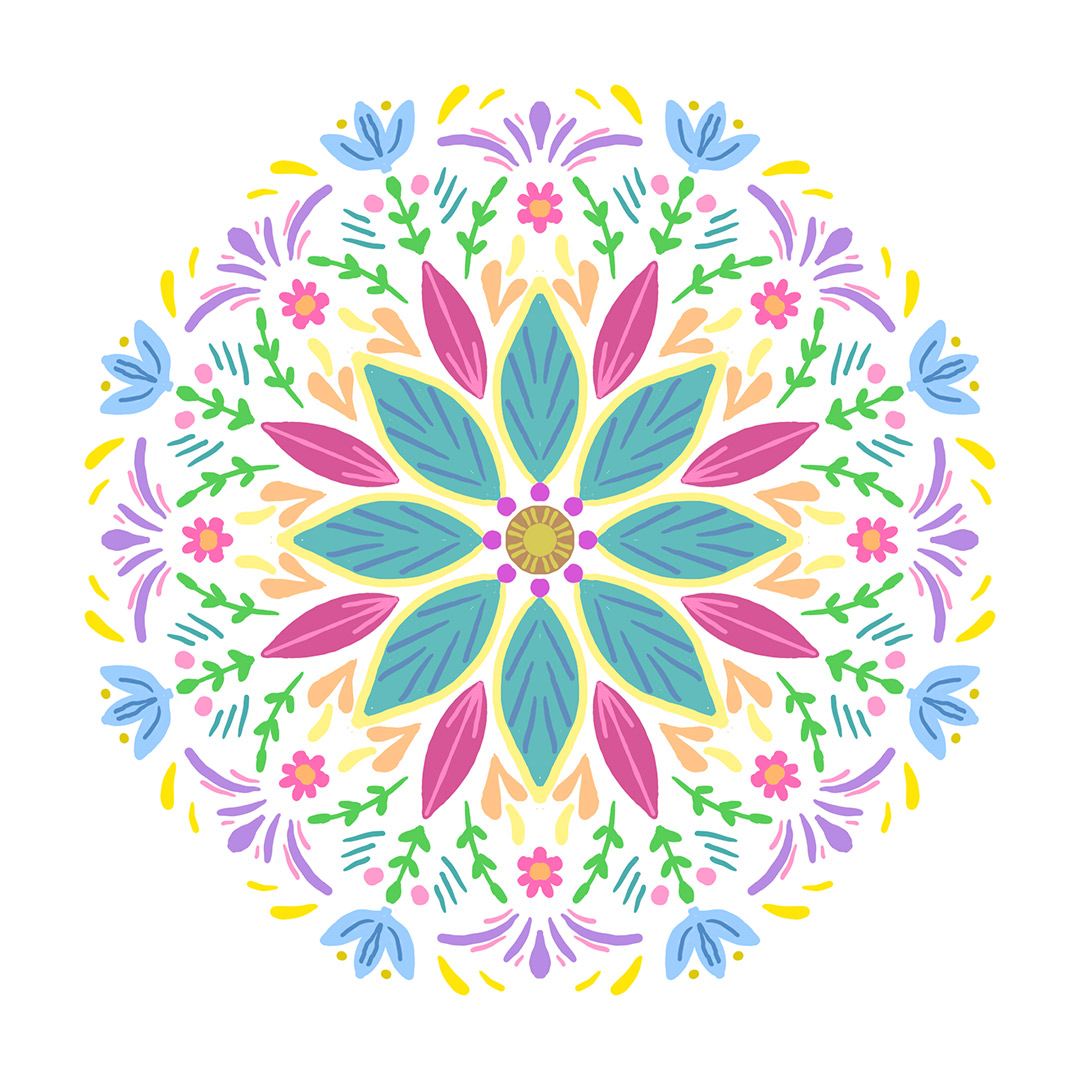
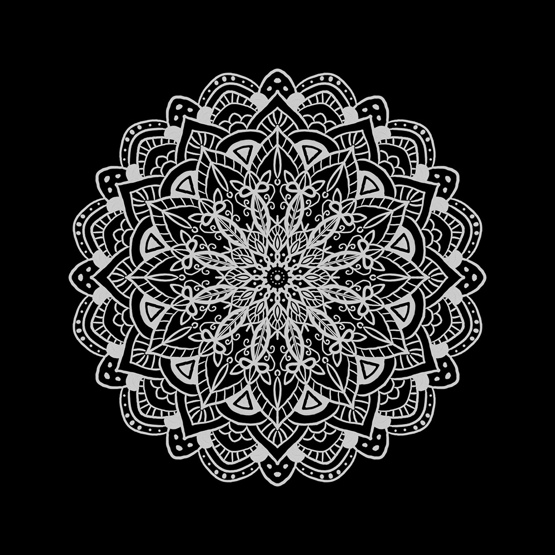
P.S. Here are the mandalas I created for my personal art project these past couple of months. Regrettably, I didn't end up doing very many, but hey, I was on vacation, ok? ;)


Links

M is for...


Fan Art Project Summary

As you may know, for my personal project last month, I chose to create fan art. I'd define fan art as any work that is derived from another piece of art that you did not create yourself, such as a book, film, or song. Usually, it is done for fun, as a show of admiration for the source material. Sometimes it can get a bad rap due to issues of plagiarism and unoriginality—but I love it.

For my project, I ended up doing a lot of animation-inspired pieces. I guess that's what happens when you have two young ones. I was pleased with how my pieces progressed as the month went by. I felt my later ones were more developed and had more of my own style. I even started a mini project making Disney princess–inspired surface patterns (which I am still working on). I also collaborated with my sister, Dani Jones, on one of them (The Greatest Showman).

Here's a look at all the fan art I created in March:

So why create fan art? I believe it has some real benefits when done right. In my opinion, here are some tips for creating great fan art:

  • First off, do not claim ownership of the original work upon which your art is based, and give credit when necessary. ALWAYS respect other artists.
  • Use it as an exercise to hone your skills, such as drawing, painting, composition, typography, portraiture, etc.
  • Go beyond copying. Bring your own style and flair into your piece. Make it your own.
  • And always, have FUN.

That last point, for me, is the best part of fan art. Even though I love what I do and occasionally even get paid to draw things, work is still work sometimes. Doing things for your own enjoyment is important to keep you going. No artist works in a bubble—at least, I certainly don't. I am always finding inspiration in what others are doing. Let great art get YOU excited to create more great art!

Sincerely, Nicole


Links

All Business, But Having Fun

February 2018 Project Results - Floral Patterns

Last day of February! I really enjoyed working on my floral patterns this month. I picked three of my favorites and created a mini collection of finished pieces.

Here are the original sketches. I united the three different ideas into one color palette, which is based on Pantone's Floral Fantasies theme.

18022401_FloralFantasies_sketches.jpg

And here are the final patterns, created as vector art in Illustrator.

18022401_FloralFantasies_01-repeat_web.jpg
18022401_FloralFantasies_02-repeat_web.jpg
18022401_FloralFantasies_03-repeat_web.jpg

Here are some alternate versions with simpler one and two color palettes.

alternate-colors.jpg

Thanks for following along with me! It was nice to accomplish something for myself that I can now add to my portfolio. I'm loving my monthly personal project idea so far! Stay tuned for something new in March...

Sincerely, Nicole

Links:

Pantone - Ultra Violet

This Month's Theme is...COLOR

Beyond Basic Color Theory—Four Things More Important Than the Color Wheel

How I Find My Colors